
The Netflix Tudum event presented a unique creative challenge: how do you translate a sound into a visual identity? Tudum is defined by its iconic audio cue, and the goal was to design an event system that captured that energy visually while staying true to Netflix’s bold brand language.
I began by grounding myself in the context of the event—studying past Tudum experiences, Netflix’s existing brand system, and how sound has historically been visualized through design. Through this research, I identified key themes of rhythm, impact, and anticipation, which became the conceptual foundation for the visual direction.
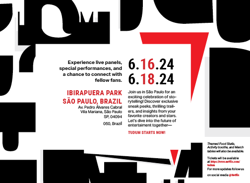
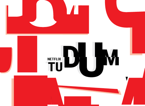
From there, I explored how typography, spacing, and composition could mimic the feeling of sound in motion. I experimented with scale, repetition, and visual pacing to evoke rhythm and presence, treating type and layout as expressive elements rather than static components. These explorations informed the creation of a scalable logo that could anchor the entire system.
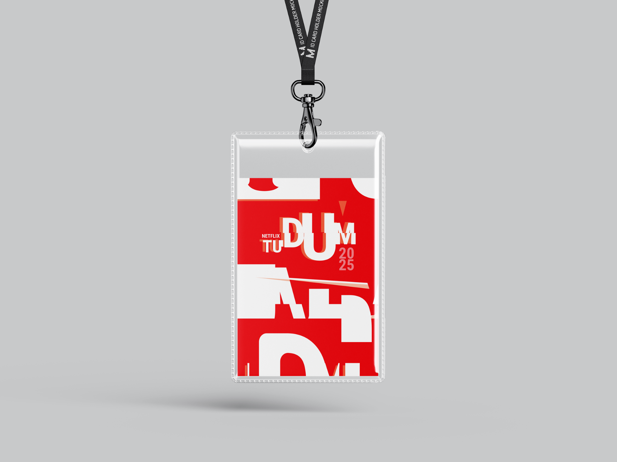
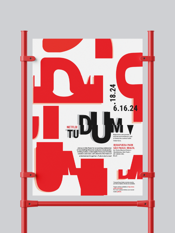
With the core identity established, I expanded the design into a full set of event materials, including postcards, event flyers, and ID cards. I developed the graphics in Adobe Illustrator and refined the layouts and typographic hierarchy in InDesign, ensuring consistency across every piece while allowing flexibility for different formats.
The final result was a cohesive event identity system that transformed the auditory essence of Tudum into a visual experience. The system was energetic, adaptable, and visually engaging—reflecting the excitement of the event while maintaining Netflix’s recognizable style. By bridging sound and design, the identity gave Tudum a presence that could be seen as clearly as it could be heard.
If you like what you see and want to work together, let's get in touch!
shrinidhi.venkateshan@gmail.com.png)
.png)
.png)
.png)
.png)